LazyVerticalGrid
Jetpack Compose provides an API for displaying grid or grid elements.
Example
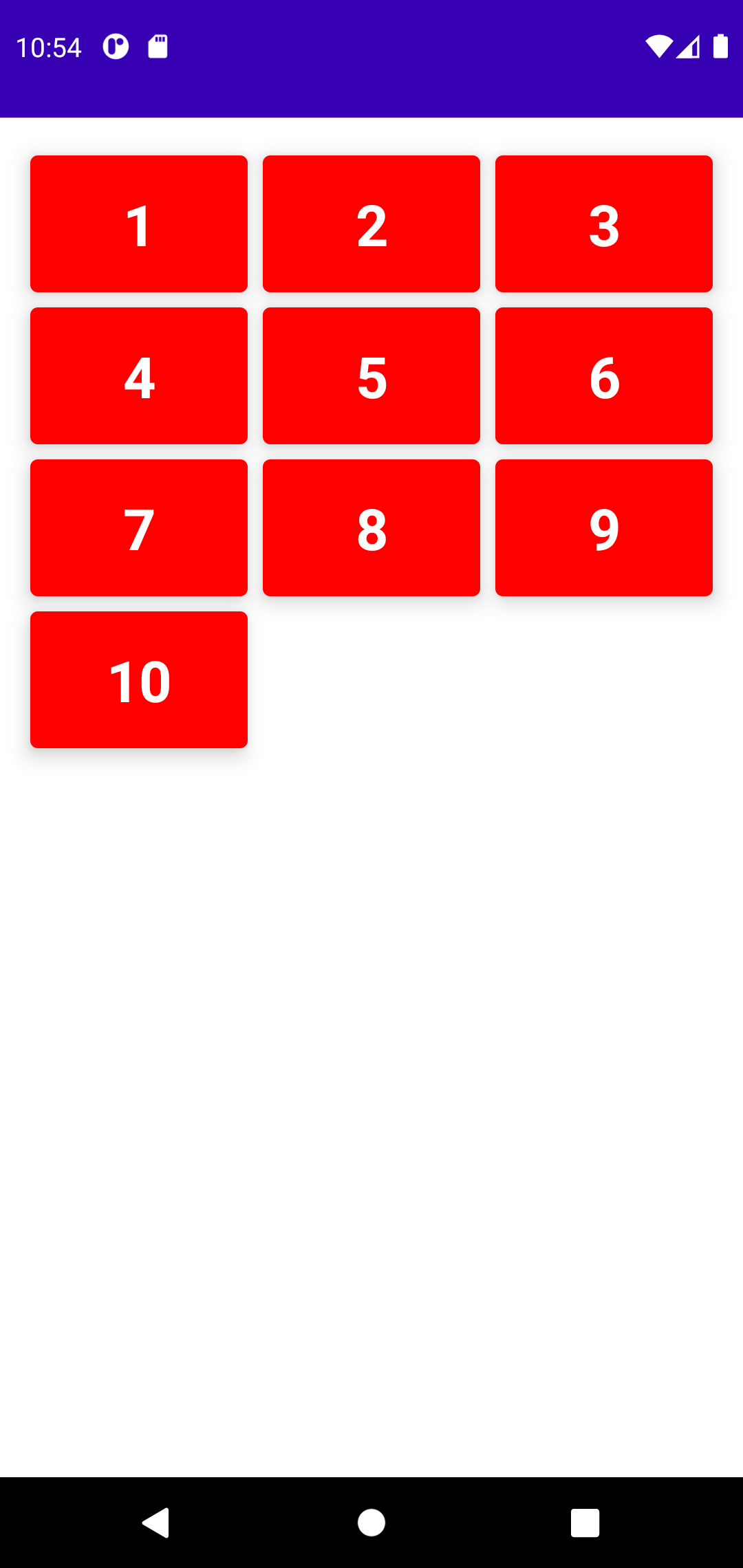
To arrange list items in a grid, LazyVerticalGrid provides a cells parameter that controls how cells are formed into columns. The following example displays the items in a grid, using GridCells.Adaptive to set the width of each column at least 128.dp:

@Composable
fun LazyVerticalGridDemo(){
    val list = (1..10).map { it.toString() }

    LazyVerticalGrid(
        columns = GridCells.Adaptive(128.dp),

        // content padding
        contentPadding = PaddingValues(
            start = 12.dp,
            top = 16.dp,
            end = 12.dp,
            bottom = 16.dp
        ),
        content = {
            items(list.size) { index ->
                Card(
                    backgroundColor = Color.Red,
                    modifier = Modifier
                        .padding(4.dp)
                        .fillMaxWidth(),
                    elevation = 8.dp,
                ) {
                    Text(
                        text = list[index],
                        fontWeight = FontWeight.Bold,
                        fontSize = 30.sp,
                        color = Color(0xFFFFFFFF),
                        textAlign = TextAlign.Center,
                        modifier = Modifier.padding(16.dp)
                    )
                }
            }
        }
    )
}
Apart from GridCells.Adaptive there are other types of cells that provide the number of columns per row. As follows
colums = GridCells.Fixed(2)
See also:
Last update: July 27, 2022